Collection
Chrome Experiments
Chrome Experiments is a showcase of work by coders who are pushing the boundaries of web technology, creating beautiful, unique web experiences. You'll find helpful links throughout the site for creating your own experiments, and you can also explore resources like WebGL Globe and our workshop of tools.
Chrome + Music
Chrome Music Lab: Song Maker
by Google Creative Lab + Use All Five
A simple way to make and share a song.
Scan Sequencer Javascript
by JeongHo Park
Using a webcam, make real-time music with your movements
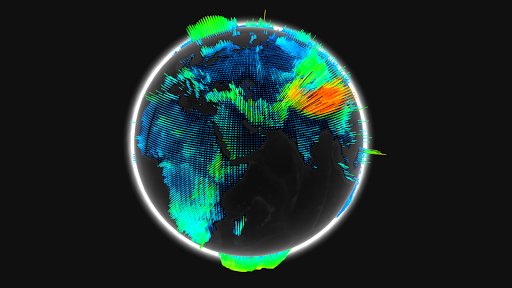
WebGL Globe
The WebGL Globe is an open platform for geographic data visualization featuring latitude/longitude data spikes, color gradients based on data value and mouse wheel zoom functionality.
Get the code, add your own data, and submit your projects to see them featured on the WebGL Globe collection.
Chrome + WebGL
Tendrils
by Eoghan O'Keeffe
Interactive music visualizations using your webcam
Biomes
by Marpi
Noise based generative biomes, click Randomize to create new or customize them yourself
Webgl Particle Audio Visualizer
by Sehyun Av Kim
A particle system that reacts to audio input
All Chrome Experiments
Tab Maker
by Google Creative Lab
Tab Maker is a tool that helps anyone create custom extensions for Chrome’s ‘new tab’ page.
Shared Piano
by Google Creative Lab
Play music together live on the web.
FreddieMeter
by Google Research, Google Creative Lab, YouTube Music
An AI-powered singing challenge that rates how closely your singing matches the voice of Freddie Mercury
HVBRD
by Charlie Gerard
Avoid obstacles on an interactive hoverboard built using your phone and a skateboard
A Century of Surface Temperature Anomalies
by Aodhan Sweeney
A webgl globe to visualize how temperatures on Earth have changed over the past century.
Flappy Windows
by Charlie Gerard
Play flappy Bird with browser windows
How New York Are You?
by Jenna Xu
A voice-controlled browser game where two players compete to be crowned the realest New Yorker.
SandSpiel
by max bittker
A creative cellular automata browser game
UFO Sightings Around the World
by Man, Grunwald, Xenopaoulos, Villafane
A project analyzing the National UFO Reporting Center (NUFORC) data using the WebGL globe
Surface Floater
by Lusion
WebGL artwork creating a physics system that surrounds a 3D model
Plexus Shaders
by Marco Gomez
A WebGL Music Visualizer
Morse Typing Trainer for Gboard
by Tania Finlayson, Use all Five and Google Creative Lab
A fun little web app to help you learn Morse code on Gboard.
Loaded all experiments